Add logo screens to Nimiq Pay app

I feel there is an issue whereby, on mobile, neither the Nimiq Pay app nor the Nimiq web wallet look distinctive from a distance.

Therefore, my suggestions is to add a menu item in the Nimiq Pay app to give the option to fill the entire screen with a choice of two different logo screens. The first would be a white screen with the NIMIQ hexagon and logo displayed in landscape mode; the second would be a dark blue screen in portrait mode of the Nimiq Pay app logo as used in the app stores. The contrast of the landscape & portrait modes, and of the light & dark screens would create some interest, and the NIMIQ logo on one of the screens would remove any confusion as to what the Nimiq Pay logo screen represented.

In the longer term, the logo screens in the app would allow for a more impactful image in a selfie or group selfie, including high profile celebrity endorsements of Nimiq. In the short term, the logo screens could feature in comics etc created by the Nimiq team and community.

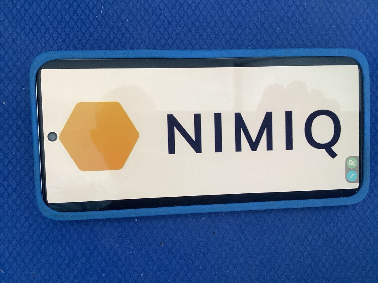
EDIT: I’ve uploaded a photo of a phone showing the NIMIQ logo to demonstrate the appearance of the logo screen…

Your suggestion makes a lot of sense, especially for improving visual recognition of the Nimiq Pay app on mobile. Right now, both the Pay app and the web wallet have a clean interface, but from a distance they can look a bit similar or generic, so having optional full-screen logo displays could really help with branding and quick identification.

Adding a menu option for two different logo screens — one light, one dark, and in different orientations — is a smart idea. It gives users flexibility while also creating a stronger visual identity. The landscape white screen with the Nimiq hexagon would be great for clarity, and the dark portrait version using the app-store logo would give a bold contrast. This would also work well for creators, influencers, or even casual users who want to feature Nimiq in photos, videos, or community projects.

From a technical perspective, this feature shouldn’t be too hard to implement since it mostly involves adding a simple UI toggle inside the app settings and displaying a static asset full-screen. It’s also optional, so it wouldn’t disrupt users who prefer a minimal interface.

Overall, this idea could boost visibility, strengthen the brand, and give the community something fun and useful — especially for content creation, tutorials, social posts, and potentially bigger promotional moments like the celebrity example you mentioned.

If the team decides to move forward, a good next step might be:

  • Add a “Display Logo Screen” button inside settings
  • Allow switching between the two styles
  • Add brightness controls or persistent display options
  • Include quick-access (e.g., a gesture or long-press) for creators

This would keep it lightweight while making the feature very practical.