Announcing Wallet Public Beta (Testnet)

Hello everyone!

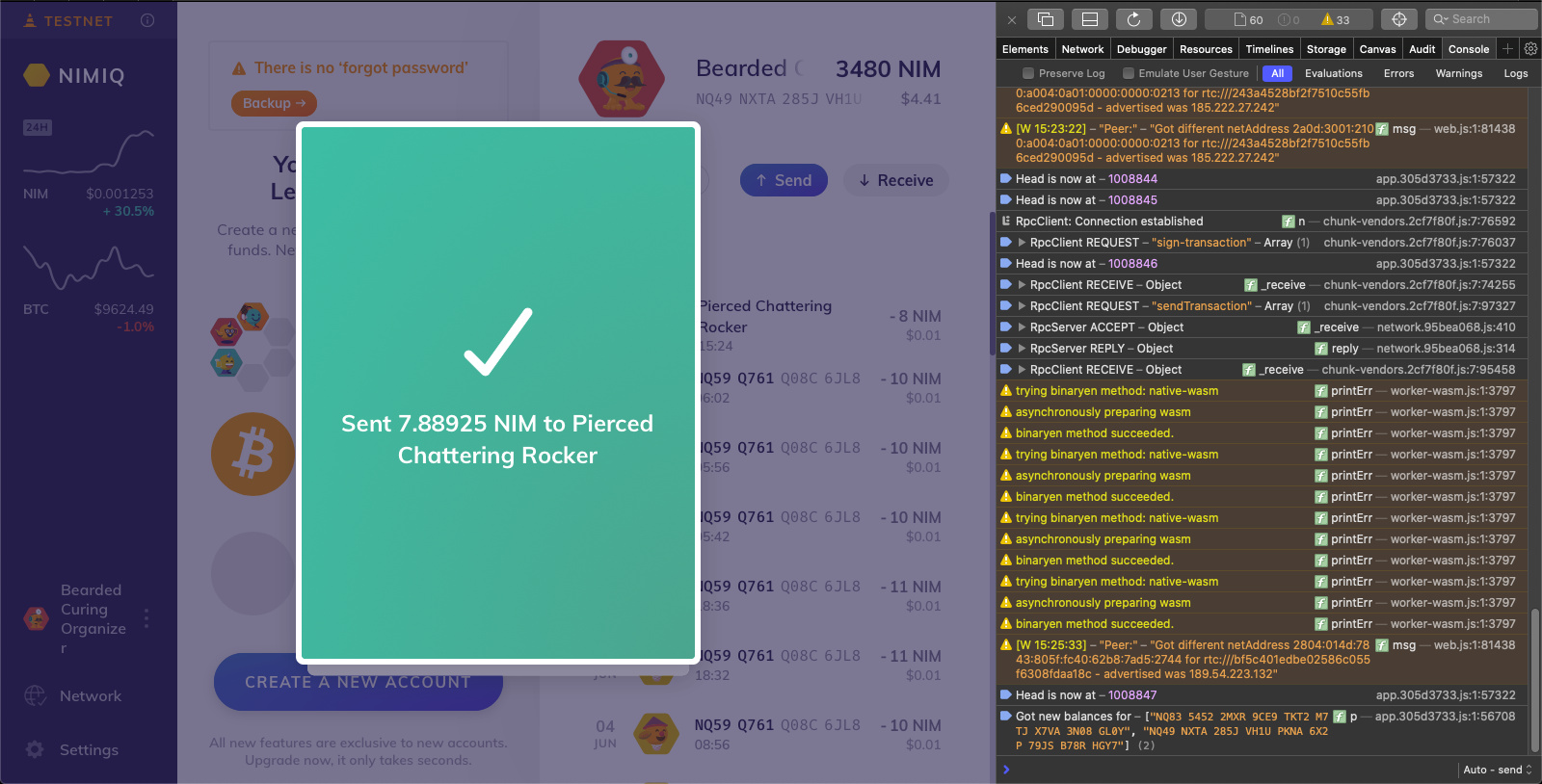
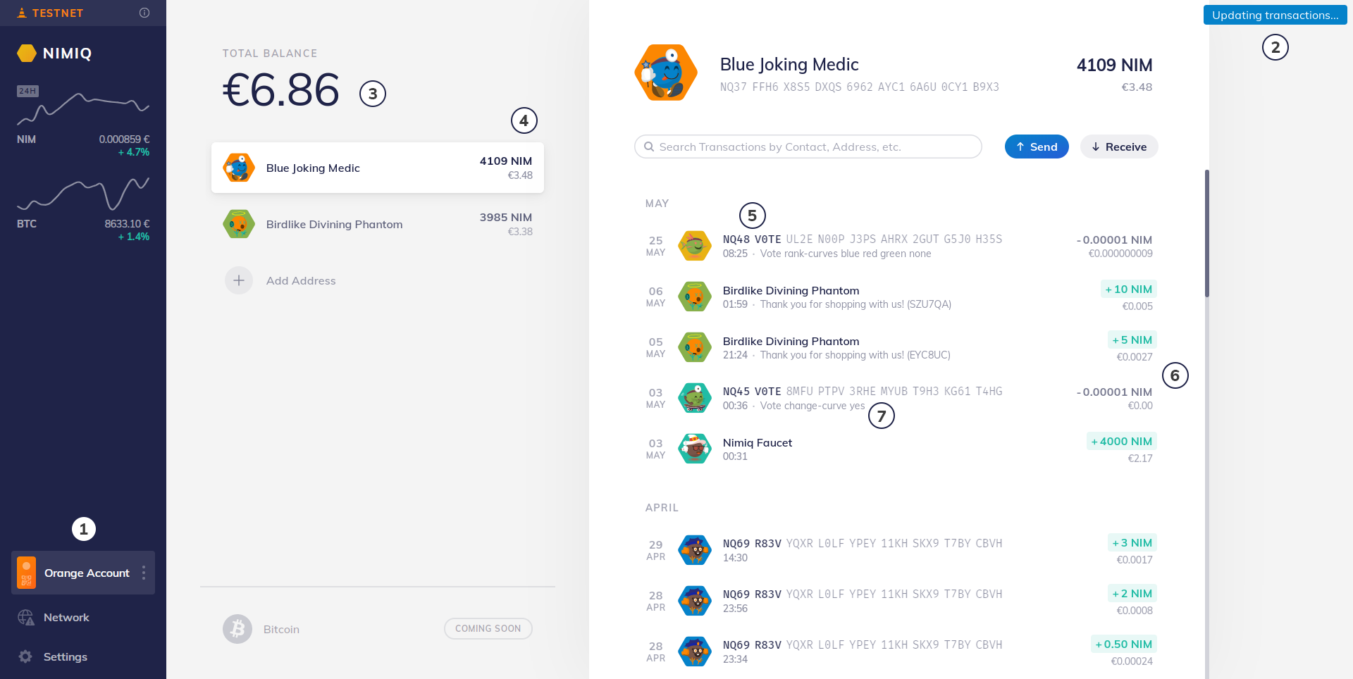
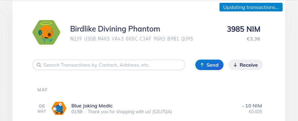
I am pleased to announce that Nimiq’s new browser Wallet 2.0 Beta is now publicly available for testing in the Testnet! :rocket:

https://wallet.nimiq-testnet.com

Since the Wallet connects with the Nimiq Hub and Nimiq Keyguard just like the Safe did, all your Nimiq Accounts and Addresses are automatically available in the new Wallet.

Android users: You can add the Wallet to your home screen through the “Chrome menu” > “Add to homescreen” option to get a fullscreen, app-like experience.

Feedback

Please provide your feedback in this forum thread (we’d also like to hear what is good about the new Wallet :wink:)

Development Timeline

We started planning the new Wallet in November 2019 when we created our Nimiq 2020 strategy. After the initial design phase, the front-end team wrote the first lines of code at the end of January. In the middle of March, a first prototype was presented to a private group of active community members, who provided invaluable feedback and have followed the development ever since. In parallel, our designers continued improving the user experience and tested various approaches to mobile design and transaction sending with our community. Now, at the start of June, only four months after we started, we present the Wallet to everyone.

Why Beta

As with everything that we build for Nimiq, we need it to go through a good testing phase before letting it handle real money. Although the Wallet itself has no direct access to your Keys and thus cannot lose your NIM, it could nonetheless display an incorrect picture of your transaction history or your balance. We are pretty sure that everything is working correctly, but we would like our community’s help to test the new Wallet with all the different web browsers, devices, internet speeds, and from countries that we simply cannot test ourselves.

As such, we are labeling this release a “Beta”, with the hope that by the end of June we can make the Wallet available in the Mainnet for everyone to experience the new way of managing NIM.

Remaining Work

There are a couple of things that we still plan to improve and add this month:

  • The area displaying your currently selected address (above the transaction history) will change slightly, reducing the number of clicks needed to copy your address and access address-specific options Done!
  • The onboarding experience will improve with a short intro to Nimiq and reminding new users to backup their LoginFile and/or Recovery Words
  • An info popup will be added, explaining where you can buy NIM and in the future allowing you to buy NIM via a widget or directly integrated with OASIS.
  • Logging out is not yet supported in the new Wallet (but you can still log out from the Testnet Safe)
  • Styling of buttons, input elements, transitions and shadows across the app will be standardized

Source Code

The Wallet source code is now open-source on Github: https://github.com/nimiq/wallet

The new Wallet is built with the Vue front-end framework and is already prepared for the upcoming Vue 3. It uses Vue’s new Composition API (currently via the Vue 2 plugin), greatly improving Typescript support and code organization. We’ll prepare a deeper dive into the development specifics in the next weeks, but feel free to look through the code in the meantime. You can also create issues in the Github repository. Pull Requests are of course also always welcome!

Happy testing and Pura Vida!
Sören

7 Likes

Really cool, informative at first glance! :slight_smile:
However, I’ve tried to create a new address, and send some amount back to the faucet address. Both action triggered the same message:
“That went wrong.
We could not detect a valid request. Please go back and try again.”

:frowning:
Thanks for the report. Can you tell me how you opened the Wallet? In an in-app browser, or in Chrome, or Safari?

Hi Sören, just clicked on Richy’s* above link. It’s a Firefox 77.0 desktop pc browser (64bit).
Occasionally I’m visiting the testnet, so I have a balance of 4000 testnet nim (which I got from the faucet back in may), so practically it’s not a new/newly created test account. Consensus established, all is looking good until I try the mentioned actions.

(*oh, sorry, I meant the link you posted in the OP)

Having opened the safe wallet link in a “testnet-virgin” Chrome made it work like a charm, no problem at all.

Just checked my other two “old testnet” addresses on two different pc-s, and it appears these addresses reproduce the error message. These addresses are similar in terms of they all mined(minted) some testnet NIM before, and/or got some testnet NIM from the testnet faucet, so they have a positive balance.
NQ92 M9EV L4JJ G1A1 DHPL X1PT V2YR U6DA QHH2
NQ56 7DD8 1U6U 1C84 5M2Q H88U DNNJ HKKU EP08
NQ12 R8JV 3VRL 00HJ VYHT KJ55 C0XV FQTR NNCS

Nice it is finally official :wink:

Tremendous work. Basically, I love the new design, but please allow me to list everything that popped into my head while using it. There’s no logic in numbers/order.

  1. I’ve made my sidebar larger, mainly because I was frustrated to see my “Orange Account” split onto 2 lines. And there’s room at the right of the screen.
    Although then, the “Updating transactions” label near my (2) is overlaping the transactions column. And that is a bit frustrating too.
    But then, I also saw that, during transition from “Network” to “Account” (slide), the “Updating transactions” label is places like this :


    And I think I may prefer this placement. This long (1) is not really important, just me having a design argument with me.

  2. About this “Updating transactions” : it never disappears. Is it just me ? Is it related to having the Warning on the Network menu icon ? On the Network page, I’m forever “Connecting, 0 Peers, Block height #0” (also tried with Adblock disabled).

  3. Thing I miss from the current wallet : couldn’t you find room around here for the total balance in NIM ?

  4. Thing I miss from the current wallet : Around here or somewhere else, have you thought of a way/button to display all addresses transactions together in the transactions column ?

  5. Eight first chars are bold to spot them easy ? Because 8 should be enough to almost always spot a unique address ? I’m a bit frustrated that the whole address isn’t displayed with a bold font. Why is there a special case for addresses, when labels or “original account names” are fully bold ? Of course, this (5) is not really important, just me having a design argument with me.

  6. Again, I was having a design argument with myself, about the colors of the amounts. Having the negative transactions in red instead of gray ? Keeping the gray for internal transactions, both + and - ? Or like you did may be the best, that was my last thought on the subject.

  7. Having the extra data / message displayed here is SO GOOD

Alright that’s it for now ! Please remember that I started with “Basically, I love the new design”. :relaxed: most important sentence there, consider that what I’m NOT talking about is what is good in the new Wallet :slightly_smiling_face:

2 Likes

Do we have a timeline for multiple languages support?

This progress should be tweeted. I almost missed it :slight_smile:

1 Like

This is so cool! I’ve had no problems mining on the testnet. I’ve sent and received testnet NIM, and everything looks really clean in the wallet. The only thing I could think of is in the network and settings sections I feel as though there should be like a back to (color) account icon in the top left corner on the page. I had trouble finding out how to get back to the transactions page. otherwise this is looking very good!

2 Likes

For me it’s been working fine lately, but in the last transaction I sent it got stuck at the Transaction Sent screen, The transaction went through but I couldn’t find a way to dismiss the green frame.

Safari 13.0.4
macOS 10.15.2

Great update, the wallet takes shape!

There are a few things I don’t understand and I’d love to hear why it was done in this way and what the reasoning behind it is.

NIM & BTC charts

image

It’s nice to have the price against fiat here, no doubt. But the charts are not really useful as they don’t have any scale. Is that intentional ?

Left sidebar

image

Why did you go for a narrow left sidebar vs. a top bar ?
A sidebar seems to be a good choice if there is a need to display a lot of elements, but for wallet there are only 3. Are there more to come ?

Amount in fiat

image

Why is the total balance only displayed in fiat currency whereas everywhere else it’s NIM + fiat (in smaller). Is it because there will also be BTC ? I’d still suggest to put the cryptocurrency first and then fiat.

These are just my opinions, but I would appreciate your feedback on those.

Will check if I can contribute since it’s now open sourced.

1 Like

Hi Mario, thanks for your feedback!

The wallet code is indeed open sourced since I wrote this announcement post!

I’ll see if I can get @julian and @Tammo in here to answer to your questions :wink:

Firefox v26 (18099) on iOS 13.5.1 (iPhone) only gives me a blank white page when I go to the testnet wallet page. It works in safari on the same device. Do you have some kind of in-app browser detection that falsely detects Firefox as such?

Hey Mario, thanks for the detailled feedback! I’ll try to answer your questions below:

NIM & BTC charts It’s nice to have the price against fiat here, no doubt. But the charts are not really useful as they don’t have any scale. Is that intentional ?

The charts are indeed just a hint at the price movement in the last 24h, and indeed the most basic example of trading charts. We thought about including more advanced features from a tooltip on mouse-position in the chart, or a possibility to adjust the scale up until having a full-blown trading view. We decided for this minimal version because we didn’t want to focus our efforts towards rebuilding something that has already been built many times before, and rather focus on things we can innovate. We might build in some more advanced functionality in the future though.

Left sidebar Why did you go for a narrow left sidebar vs. a top bar? A sidebar seems to be a good choice if there is a need to display a lot of elements, but for wallet there are only 3. Are there more to come ?

We actually did some experiments with a top bar in early iterations, but found the sidebar made the most harmonious impression in combination with the other parts of the interface. We don’t plan to add more elements to the main navigation, but the space is meant to be used for notifications, announcements and e.g. as an entrypoint to an onboarding tour. You’re right – depending on the screen size and whether or not those extra elements are in place, the sidebar has quite some free space. We deem this not a bad thing though – especially if your screen is big, it doesn’t matter, and if it’s smaller we found that the vertical space is actually more constrained than the horizontal.

Amount in fiat Why is the total balance only displayed in fiat currency whereas everywhere else it’s NIM + fiat (in smaller). Is it because there will also be BTC ? I’d still suggest to put the cryptocurrency first and then fiat.

Indeed, the reason we only show the fiat amount here is that we’ll have two currencies in the wallet. We thought a lot about adding a summarized amount for each currency, but in the end decided against it because it would mean a lot of duplication and redundancy for people with only one address (also, there will only be one Bitcoin address per Nimiq account). We looked at other multi-currency wallets and found that they are handling this in the same way, and decided to go this way for now

2 Likes

This is so cool! I’ve had no problems mining on the testnet. I’ve sent and received testnet NIM, and everything looks really clean in the wallet. The only thing I could think of is in the network and settings sections I feel as though there should be like a back to (color) account icon in the top left corner on the page. I had trouble finding out how to get back to the transactions page. otherwise this is looking very good!

Thanks for the feedback! I see your point and we’ll have a close look at it going forward :slight_smile:

2 Likes

Thank you @paulghz , really appreciate the detailled feedback!

I’ve made my sidebar larger, mainly because I was frustrated to see my “Orange Account” split onto 2 lines. And there’s room at the right of the screen. Although then, the “Updating transactions” label near my (2) is overlaping the transactions column. And that is a bit frustrating too.

Yeah, this is something we might consider for bigger screens. The responsiveness for big screens is still in the making, but essentially we’re planning to even out the spacings in a way that until ~1920px width there is no room on the right. The “updating transactions” label is a bit of a development tool right now, it will be located differently, coupled with the TX history, so no need to worry about that :slight_smile:

About this “Updating transactions” : it never disappears. Is it just me ? Is it related to having the Warning on the Network menu icon ? On the Network page, I’m forever “Connecting, 0 Peers, Block height #0” (also tried with Adblock disabled).

It’s supposed to disappear once new TX are loaded, this will be fixed.

Thing I miss from the current wallet : couldn’t you find room around here for the total balance in NIM ?

We decided against it to avoid redundancy, especially if someone only has one NIM account, which we assume to be a frequent case, especially for beginners.

Thing I miss from the current wallet : Around here or somewhere else, have you thought of a way/button to display all addresses transactions together in the transactions column ?
This is not planned – we thought about this a lot and did some experiments, but especially as we’ll be adding Bitcoin as a second currency, a combined TX history would get very crowded. We’d like to think of each NIM address as an entity with its own purpose. Following this concept, having the TX history focussed on the address seemed like a reasonable trade-off.

Eight first chars are bold to spot them easy ? Because 8 should be enough to almost always spot a unique address ? I’m a bit frustrated that the whole address isn’t displayed with a bold font. Why is there a special case for addresses, when labels or “original account names” are fully bold ? Of course, this (5) is not really important, just me having a design argument with me.

When reading your feedback, we had to agree. The way it was designed was focussed on one specific assumed use-case and might lead to misinterpretations. We already changed it to displaying all address chars equally.

Again, I was having a design argument with myself, about the colors of the amounts. Having the negative transactions in red instead of gray ? Keeping the gray for internal transactions, both + and - ? Or like you did may be the best, that was my last thought on the subject.

The reason why outgoing transactions are grey and not red is a) to avoid the resemblance of an outgoing transaction as something negative – this is always an intentional action initiated by myself – and b) to better highlight incoming transactions, because in opposition to outgoing transactions they are not synchronous with my actions.

Having the extra data / message displayed here is SO GOOD

Thanks :slight_smile:

4 Likes

I am an old user who mined several years ago when the login system was via a password and pin. I booted up my two old machines that I used to access my mining account back then and one has been offline and had the old Firefox, the other has been online and has new Firefox. On the PC with new firefox, the wallet upgrade process is not working, it will not show my recovery words when I enter my pin.

On that PC, when I enter my pin to unlock the recovery words and go through the upgrade process the console shows this error: “Content Security Policy: The page’s settings blocked the loading of a resource at https://keyguard.nimiq.com/request/export/?rpcId=xxxxxxx#recovery-words-unlock (“form-action”)”.

Any ideas for possible workarounds @NimiqSoeren? Possibly related when the upgrade popup opens it shows this warning in the console: Content Security Policy: Directive ‘child-src’ has been deprecated. Please use directive ‘worker-src’ to control workers, or directive ‘frame-src’ to control frames respectively.

I’d hate for all my NIMIQ to be lost forever, unfortunately the laptop that was able to go through the wallet upgrade properly was not my main machine and all of my NIM are on the computer where the wallet upgrade process is failing.

Hi, sorry you are having problems accessing your NIM.

AFAIK the Content-Security-Policy error/warning is not relevant. What happens when you enter you password? Does the box wiggle and blink red? Or simply nothing happens?

Do you have the recovery words of your account from the old computer? If so, you can import them into the new one and access the same account, no?

If this doesn’t help/work, you can also write me directly with more details :slight_smile:

Thanks for the reply!

The Content Security Policy error appears in the console exactly when I enter the 6th and final number in the pin. The box does not wiggle or blink red, there is no visual effect what so ever. I am able to delete characters and re-enter them. If I re-enter my password the error will appear multiple times in the console, each time exactly when the final character of the pin is entered. I’m virtually certain the pin I entered is correct.

Unfortunately I don’t have the recovery words :confused:

Thanks for the help!