Homepage Revamp

One of the main problems with the website homepage is the poor job it does at making Nimiq shine. We saw it many times with streamers who are asked to take a look at Nimiq and end up on a page with generic statements that totally fails at conveying a message.
The poor first impression hurts Nimiq more than we give it credit for considering the large amount of traffic the page gets.

In preamble I think we should target people not totally new to crypto but not too technical either. The current homepage tone is too vague and general, it feels like it talks more about payment cryptos in general than Nimiq, you could change the logo with Litecoin and you could keep 90% of the content.

  • I would ditch “Open Money”, the very first thing that should pop on the website is nimiq’s ambition: mass adoption. Nimiq is not another fork trying to copy Bitcoin, it’s a cryptocurreny designed from the ground-up to be “Average Joe-centric” and bridge an existing UX gap.
  • Now how does Nimiq try to accomplish that? By creating the easiest UI (simple), by providing a cutting edge transaction speed (lightning fast) and finally by centering its integration around the browser.

  • No more “inspired by Bitcoin” (every single crypto is inspired by Bitcoin…).
  • Nimiq is fundamentally about the Web and Blockchain, targeting excellence in both areas. The original description is too modest.
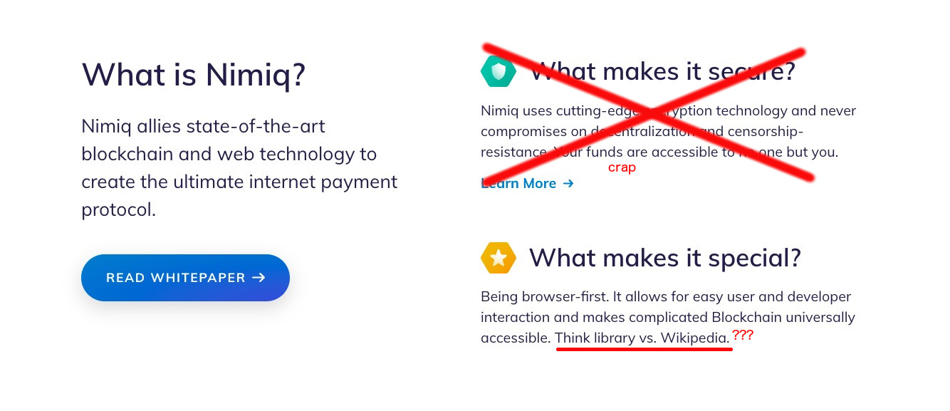
  • Ditch “What makes it secure”, all cryptocurrencies are designed to be secure, let’s talk about something else, something exclusive to Nimiq.
  • The “library vs wikipedia” is a weird analogy, I don’t get it at all. Overall the “What makes it special” is bland, I think you could find something more impactful to write to describe it.

Now the “What I can I do with it” is probably the saddest part, it isn’t exciting at all.
I would completely ditch it and instead go with something like “the 3 pillars of Nimiq” talking about the browser native aspect, Albatross and finally OASIS.

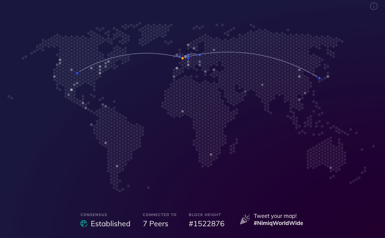
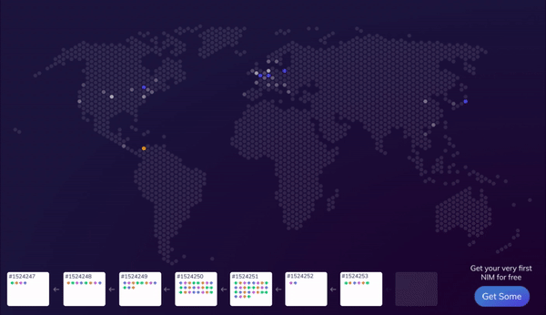
The rest of the homepage is fine, however what I would really like to see is a frame with a big “connect to the Nimiq Blockchain” and the map above displaying itself or something equivalent. During the ICO nimiq.com landed you on the map and it had a big “wow effect” value because traditionally if you want to connect to a chain you have to use some clunky desktop applications, browser extension or straight up command lines.

12 Likes

Ultimately, I expect much of the front page to change with the release of 2.0 so some of your reservations will undoubtedly be addressed.

My only major disagreement is with your inclusion of the map. While I agree that the home page requires some panache, the map is far from ideal. Simply put, it lacks substance: it doesn’t tell you anything about the network, aside from the geographic location of its users. As you said, how is this information any different than Bitcoin (aside from the fact that Nimiq has a pretty graphic)? The information is pretty much useless, even if it is eye-catching. Instead, I believe that the Albatross chain - as shown on the Albatross page - accounts for both style and substance. Beginners can see a live representation of the chain while intermediate and advanced users can infer tps, bandwidth, etc.

Lastly, when NIMIQ 2.0 comes out, the fixed size of the blockchain should be listed with emphasis too. It’s a very impressive feature!

2 Likes

I like what you said about the Albatross webpage. The Albatross’ demo page is mesmerizing, and invites visitors to figure out what’s going on. Maybe a combination of the world map with real/live transactions between nodes could have the same effect for the Nimiq homepage …and a big button to receive their first very own Nimiq transaction with free NIM from the Nimiq faucet.

4 Likes

Literally love all of these suggestions. Hard agree with a number of points made, especially around the “secure”, “inspired by Bitcoin”, and “What you can do with it” sections.

1 Like

Great stuff, I also agree with talley on all the points. one thing that I would like to add, the “Create Account” button is way too small and people don’t really see it. We want people to dive in and get started! So my 2 suggestions:

  1. make it more obvious how and where to start with the nimiq blockchain directly in the browser, no downloads.
  2. change the text of that button. “create account” is very bad, many people associate bad things (email sign up, confirmation email, give details…) maybe replace with “get started” or “join the nimiq blockchain” or something so people are more inclined to click and find out.

but most importantly: Make it more prominent!

4 Likes

This is more or less what I was talking about the Nimiq network world map and Albatross demo combined on the Nimiq homepage

final

9 Likes

I totally agree with that, btw the in the screen I changed “create account” to “create wallet” for the same reasons you exposed. Imo there is a negative emotional load associated with having to create “yet another account”.
I also agree that the homepage lacks a call to action.

3 Likes

I think all the suggestions are very successful.
The button could be named Open Nimiq or just Join Nimiq. The placement of the button is perfect, only the button could really be a little bigger.

The world map should really contain a lot more information.
The transactions should be visualized and much more. The world map has enormous potential that must be used.
The world map should also be easier to find in the Nimiq Wallet. Of course it is really very simple, but it should shine out.
New Nimions feel much more connected to Nimiq because we create a network effect. Without this effect, it is always just good technology.
We need to bring millions of new people to the network in the next 12 months. Word of mouth is still the best marketing.
Nimiq was supposed to be Bitcoin’s little twin, the color is already the same. The Web Bitcoin, only faster, more decentralized, more secure. Spread the word and let the people know about Nimiq.

2 Likes

I agree with “Create account” button being small and should be renamed. I tried onboarding users by just linking them to main website and some of them asked “where?”

2 Likes

I agree that there should be more demos on the home website, like that albatros demo should be showcased somewhere on the home page, even if it’s just an animation. Also, there need to be far more ‘call to action’ links on the site. A large login or create button, a get started now, etc.

Lastly, much like Lifes’ good isnt actually what LG stands for, New internet money should become synonymous with NIM. It instantly describes what nim is going for (much more than open money, which could be argued applies to every crypto). If I google new internet money, I want Nimiq to be the first hit!!!

3 Likes

Here’s my revamp mockup of Nimiq website inspired by Apple website’s Apple Card page.
(click image to see full)

5 Likes

How this happened without my attention! I agree with all the points! Great job!

1 Like

@Talleyrand

To further your point, ‘Open Money’ will be misleading after 2.0 since proof of stake networks are permissioned by nature, meaning one can only acquire coins from someone who already has them. Whereas under the current proof of work protocol coins can be acquired by anyone who has hardware, and (at least at the protocol level) they can’t be stopped from doing so.

Not true entirely, coins may still be staked and kept and faucets will still exist as well as the other NIMIQ games that reward you in NIM but I see what you are getting at, as the community grows so to will the ways of obtaining NIMIQ.

People can always use OASIS and bypass having to buy from an exchange and this is a truly decentralized way of acquiring a stake.