Chugwig, maybe you have a relationship with current identicons as the Dogecoin community has with their logo and Comic Sans MS font. They insist that it’s great, and in their case it is great because it springs from their fundamentals. But Nimiq identity is not tied to someone’s bad design decisions made long time ago.
I would argue that the current idenicons are great as a gimmick, and a proof of concept (since they are functional and a visual address representation). also they are like 1000 times better than all the other visual solutions I know (the ugly “faces” of MyEtherWallet for example).
The quality (not talking about visual quality, more about functional) of identicons is way below 5/10.
Why do you think that the functional quality of the identicons is that low? how do you think their function could be improved?
Right now, they function as another way to make sure you are using the right address, as well as distinguishing between your different addresses in your safe. They work perfectly fine for that, and other than a visual overhaul or different “stlyes” of identicons (more playful, more technical, more simple) I don’t see how this system could further be improved much.
1 Like
I cannot answer your questions about how the new design should look like. The answer is a result of research, strategic and creative thinking, and may require many attempts before the right solution is found.
I’m re-posting the information I shared on the Nimiq Developers telegram channel a while ago, you may find some of the answers there.
I’m not suggesting the pixelated version as the solution, it’s only used here as an alternative and for the sake of comparison!!!
To see everything (it’s a long vertical pic with more text), open the image in a new window.

I’m refering not to this special function of identification, but to the general core function of graphic design, which is visual communication.
Identification is easy - just randomize a bunch of different objects.
The hard part is to make the design simple, but unique, and to align it with the values of the project.
I took the first hexagonal identicons image from google and made this mockup.
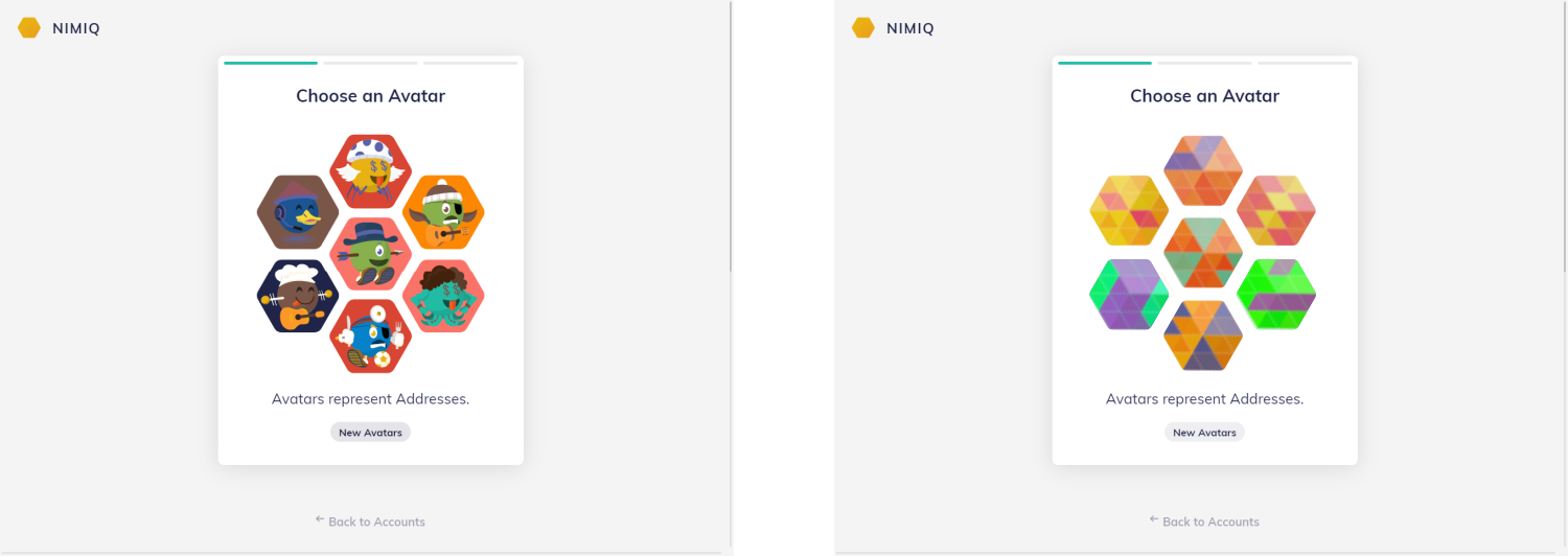
Why the abstract identicons are better?
-
They do not express the negative/strange emotions, as some of the illustrative ones do.
-
They do not look that childish.
-
They do not communicate so much information as the illustrative ones. The abstract shapes allow the user to put any meaning he or she wants into them.
-
In general, the whole page looks more subtle, solid, professional.
-
They do not create an impression that there is some hidden meaning behind the avatars, while the illustrative ones can imply that they represent some kind of roles or different types of addresses.
-
From the development point of view, they are more lightweight and in some other ways better.
About the identification:
- The color and the maze of shapes in these abstract identicons help to distinguish one from another easily. The function of identification here works similarly as in the illustrative ones, and in some cases, even better.
Also, a question:
Is there a real need to have this screen at all? The address can be picked automatically.
I bet some people think similarly as I do about the illustrative identicons.
Nimiq is great not because of the identicons, but because it’s a JavaScript blockchain in your browser. But now the identicons take all the attention.
Maybe just remove this screen and let people experience the magic of the browser-based blockchain faster and easier.
Here’s a short answer, they’re not better. Definitely not objectively better, maybe they’re better in your opinion but that’s not the same. I wouldn’t be able to tell the difference between one of your suggested identicons and a similar one. With current identicons they’re very easy to tell apart, and in the case where there’s confusion it could be easily cleared up. Your suggestions don’t allow for that at all, instead making it cryptic and less useful in favor of having a design you simply like more.
Your constant “I know better than everyone” mentality is incredibly frustrating and using ad hominem to detract from my argument just proves you are only willing to push your own agenda rather than listen to feedback and adjust. You ignored every point I made about the identicons and simply tried to devalue my argument by making some ridiculous dogecoin comparison.
2 Likes
Chugwig, I know you for almost two years. It’s you who tries to frame me into your storylines and is putting labels on me. That’s the first reason why I ignore you.
The second reason is that you are the farthest thing from a designer. We know your background and how your designs look like.
You rush to write long texts with rationally sounding arguments, but don’t even try to understand or even fully read what I write. That’s always the case, since you became so vocal in the community, and have a strong opinion on all matters.
Your argument that it’s only my personal and subjective opinion is a generic argument, that can be used in any design-related discussion.
Specializing professionally in branding and graphic design for 10+ years, I continue learning and always try to treat design from as much as possible objective perspective.
And of course, even though working in the field professionally, I can also be wrong.
Since you seem determined to make this a personal attack I’ve PMed you to keep this thread clean. I’d simply like to restate my points since you did nothing to refute them:
- what’s wrong with the current designs that is so bad that time should be spent designing new ones. Especially since the community could go and design their own just as easily as the team could, and this wouldn’t take time away from important projects like 2.0 and OASIS.
- how are your suggested identicons easily explained to another person? It’s not as easy to describe as current identicons.
- how are your suggested identicons not easily mixed up with each other. It seems like a jumble of shapes and colors, just like ETH and other chains have. Nimiq identicons were designed in such a way as to make them discernable from each other and that feature is important imo. Any proposed redesign would have to keep the discernable nature of the current identicons.
Neutral is good here. Nim logo is neutral, it is great. The current identicons are fun and will appeal to a younger niche, but not to average joe public, we all have different tastes, why risk putting someone off onboarding. For a first experience of open money it must ooze competancy and instill the confidence we know is warranted by the code behind evenly… so often less is more in these design decisons. UX too, imagine a player buying blasters in a robot battle game, the style clash that would occur going from game to identicon. Plus one on the abstract from me.
2 Likes
Great points! I completely agree neutral is good and about the identicons. I think they appeal to an older audience just as well as a younger one, but to each their own. Not everyone wants the most serious application in the world.
But if there are people who want a serious application, why wouldn’t a community member make it. Besides more serious identicons, tax tools and budgeting would be nice to have in a serious version of Nimiq Safe. But there’s also another hundred features that would be great for the safe, and the team can’t implement them all. The good thing about cryptocurrency, and specifically Nimiq, is that you can easily develop your own application with no affiliation with the official one. The identicons work off a library where the graphics could easily be swapped out (though the tens to hundreds of hours designing the new identicon features can’t be ignored) and Nimiq safe is nothing but a frontend to the blockchain so you could make your own web wallet and custom identicons. The Nimiq team has even made it possible to host your own Nimiq Hub so you could have others using your more serious web wallet in other people’s applications. All it would require is changing “hub.nimiq.com” to “hub.whereveryouhostit.com” in any applications that want to use the serious safe.
As for what you said about the blasters and a style clash, idk why that’s an issue at all. For one, a game with blasters sounds like it’d be targeting the same younger niche you say that identicons are good for. And two, Nimiq Safe can’t be expected to mesh stylistically with every single application that uses Nimiq. If clashing is a big issue for the developer they either need to adjust their design to match Nimiqs, they need to deal with the clash since it’s the same as clashing with PayPal, or as I’ve said before the dev could just create and host a version of Nimiq Hub / Nimiq safe that has a similar style to the game.
To summarize, I have nothing against a more serious design for identicons and have always believed it would be needed eventually. What I’m against is this idea that the Nimiq Team should start working on a whole new set of icons when they’ve already made it so easy for the community to make infinitely many different styles of icons. Time spent redesigning identicons is time not spent on OASIS or Nimiq 2.0 or who knows what else. You need almost no dev experience to design new identicons, and I’ve offered many times in the past to help anyone with a project that requires some small dev experience so that the person I’m helping can do what they want, purely because I want people in the community to not feel held back from using their skills to benefit Nimiq. Also, some of the complaints regarding the identicons relate to the emotions they show or other things that could easily be altered without redesigning all of them. I’m much more in favor of modifying the existing to be a bit better, and then leaving the other designs to the community to make as they feel they’re needed.
I’m also against the suggestion of abstract identicons. Sure they’d look cleaner or more modern or whatever we’re going for using abstract designs, but it’d lose the most important feature of identicons. Identicons are to prevent clipboard jacking and nothing else afaik, many accounts even have the same identicon (though finding an account with the same exact identicon as yours would take a long time). I’m not supposed to care whether my address has a blue floating ball with a beak as an identicon of if it has an orange ball with shoes, confused eyes, and a cowboy hat. All that matters is that whatever my identicon is, I can describe it or send a picture to someone and they should have no difficulty telling whether the identicon for the address they pasted is the one I described/sent.
With abstract identicons the ability to tell two similar looking identicons apart could get lost. With pixelated versions of the current identicons I think it’d still be easy to tell the difference, but describing it in words might be a bit harder. And for the colored triangles thing that was suggested, you lose all pros of identicons. I can’t think of how I would go about explaining one of those, and it wouldn’t be easy to tell two similar ones apart afaict. For example in the image Gie posted, red and orange as well as yellow and darker yellow mesh together and are hard to differentiate. Maybe there’s a way to do abstract right, but it’s definitely not as easy as leaving the identicons as they are. And if someone believes they know how to do abstract identicons the right way they are free to put it together themselves and I’d be happy to help them host a demo of the identicons or whatever else they need.
2 Likes
I agree having the identicons re-designed would be a good thing sometimes in the future (not an emergency though), they are one of the last big “legacies” of the original design and while cute they look less refined and a bit clownish compared to the rest of the new UI, less pure in a way.
Also they don’t use animals which is a big shame for the New Internet Money developed in the country with the most diverse fauna on the planet .
I’m not much of a fan of the 8-bit revamp though or anything more abstract, it looks more artsy but it’s less recognizable and harder to describe to someone in a few words (which is one of the purposes of the identicons).
I would like to see the clarity of the artstyle remain but featuring things more neutral than a guy with dollars sign in the eyes holding a beer and playing football.
2 Likes
Oooh I really like the idea of using animals in a new identicon design. Would definitely be easy to distinguish animals from each other and there’s plenty of variety of animal shapes without worrying about overlap. Similar looking animals couldn’t both be used (tiger and leapord, snake and worm, etc…) But there’d still be plenty of choices.
Combine that with other features (orange snake wearing a hat) and you have some cool and recognizable identicons.
Maybe just remove this screen and let people experience the magic of the browser-based blockchain faster and easier.
That’s worth debating, I think picking up an identicon gamifies the experience for new users currently.
Another point for the choice is the social aspect:
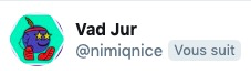
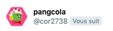
As you can see, some members of the community are adopting spontaneously their Nimiqons as avatars on Telegram, Twitter and Discord.
It’s a way for them to display support and belonging to the Nimiq community while keeping an identity for themselves, obviously they seem to like their pick.
Beyond the cuteness of the phenomenom I could see that benefit Nimiq if when it becomes more popular.
3 Likes
Talleyrand, agree with your points about using identicons. Yes, in general identicons are great, and can enhance the experience.
If someone can create simple abstract identicons incorporating animals, that would be amazing. But it’s also very hard to do this well. The more meaning you put into a symbol, the more chance it may be wrongly interpreted.
And of course, if animals, then they need to be very abstract, and communicate not the Zoo but the Browser-Based Blockchain.
I think investing in new identicons is wise because, first of all, it doesn’t interfere with the development of the OASIS (these are two different areas, can go in parallel), the second thing is that these icons are THE main touchpoints between Nimiq and the users. A big part of users’ impression comes not from the quality of the underlying code, but from things that they see and feel.
2 Likes
A few top designers/design studios that specialize in this particular field of symbol, icon, visual communication design:
https://twitter.com/iconwerk
https://twitter.com/helloutopia
https://twitter.com/HelveticBrands
Maybe someone from Nimiq can contact them about the possibilities (better not through Twitter). A good idea is to include a link to this forum topic so that the designers can get an idea where we are now and where we want to be.
I think the first designer - Iconwerk - can be perfect for Nimiq. Check his Twitter feed and his website !!!
Helloutopia and HelveticBrands are top studios specializing in this design field. Their designers are the best in the world as considered by such sites as Logopond and Dribbble. They are not big corporate ad agencies, but little studios that really love what they do.
Identicon design is a niche field, so no one specializes particularly in it. Iconwerk specializes more in icons design, and the two studios - in brand identity and symbol design. But since they are so close to the identicon design, I think that any of them can create really great looking and functioning identicons for Nimiq.
If they cannot help, they may provide some good recommendations.
I think it would be cool if NIM (the currency) was given a life that is distinct from Nimiq (the ecosystem). I like the new website, but it’s hard to tell if “Nimiq” is a company, a currency, a foundation, or something else. And when I go to send a transaction, it is shown in NIM, not in Nimiq.
1 Like
Instead of “Show Link” and opening a new window for cashlinks, just maybe get a button that says “Copy Link” and copies it to your clipboard?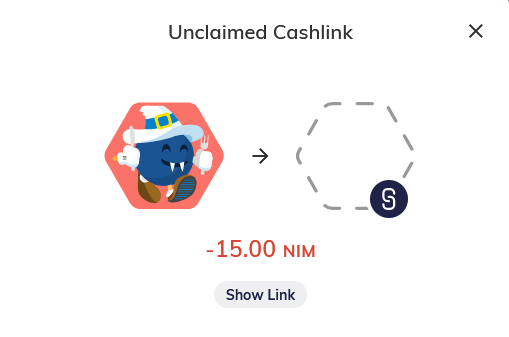
Dear Nimiq web team
As always, the best bloody webdesign in all of crypto, congratulations.
Now, I seem to miss a navigator, something like a upper-left/right-corner square or tripple-bar icon that, when I click it, shows me links to other parts of the web based nimiq content.
For example, I was looking at my wallet and wanted to check in here in the forums, but forgot the web addy at that point, so had to go look it up. That is, I was on https://wallet.nimiq.com/ and wanted to check forums, and since I couldn’t find a link anywhere I started typing http://community.nimiq.com/ (NXDOMAIN), then a couple of other silly tries, until I went searching google for it.
This was a bit of a detour to find Nimiq related content. So, please, give us a navigation button that is the same looking and in same place on all Nimiq content 
Keep up the good work!
1 Like