Let us know what you think about it 
Send here your UI/UX feedback
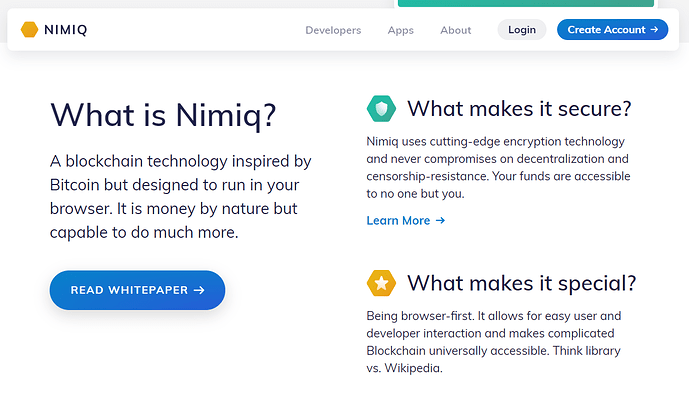
First impression: It looks sleak!
I’ll try to go over it in a few hours to see if I can find any issues. Good job!
Will there be a seperate UI/UX feedback thread?
If not: there is no way back from https://nimiq.com/developers to https://nimiq.com/
agreed. Nimiq dev center now is a separate site but we will work on integrating it in the near future 
About the UX/UX, my intention was to use this one but we can create a separate one if there are too many answers
On https://nimiq.com/community/ it says there are 13 community projects, I count ~23 on https://nimiq.com/apps/
It was meant as Community Funded projects. But I think you are right with that one, we should include non-funded projects 
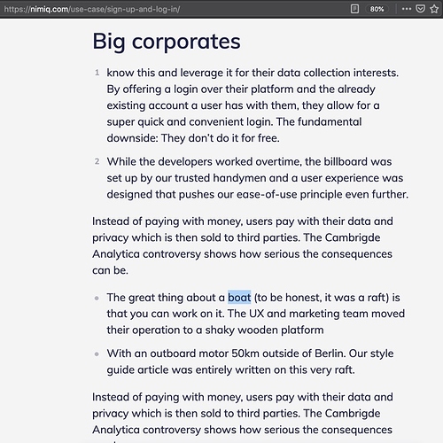
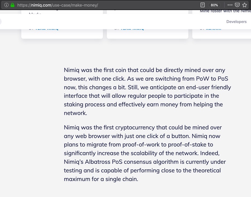
Some text i noticed to be double or did not belong there at all (boat). > see next reply, can only post 1 screenshot.
I found some more:
“Creating an account with any new web service is often inconvenient. There are information to be provided and a new password to be memorized.”
-> information is always singular. “There is information to be provided”
The Cambrigde Analytica
->typo: Cambridge
“Team Nimiq anticipate Nimiq 2.0 to be capable of processing five times more transactions per second than PayPal.”
->“Team Nimiq” is a singular in this case, so “Team Nimiq anticipates”
->“five times more transactions per second than PayPal” is quite weak imo. Paypal can basically process as many tps as they want, because they are a centralized provider. I’d go with “… up to 1000 transactions per second, which is about five times more than PayPal currently does”
“Team Nimiq is currently working with WEG bank”
-> WEG Bank
IMO, it’s missing a headline like “What makes NIM a currency” or something, with the characteristics of a currency listed below.
EDIT: "Almost always there are fees, cuts and people profiting of donation without the donator even taking notice.”
-> “profiting from donations” or “profiting off of donations”
“Empowered by a super easy to use tool that”
-> “a super easy-to-use tool”
Roadmap
Why does the link to the roadmap does not say “Roadmap” in the preview?
Q3 2018 Nimiq Swag Shop opened
“Nimiq opened it’s Swag Shop”
-> its
Q4 2018 NET end-of-life
“The NET token has reached it’s end-of-life.”
-> its
Q4 2019 Nimiq 2.0 Testnet
“show-case”
-> showcase
Q4 2019 Nimiq ID
"A convenient single single-sign-on based on your Nimiq account will become available as “Nimiq ID”.
-> “single single-sign-on”?
Suggestion from LTD on Telegram:
"I think overall the new site delivers a clear message, just one thing I would change is to create an insentive for new accounts such as moving the “Get Free NIM” wording to the top of the page.
ex: Create an account in 10 seconds and earn your first NIM. It’s that easy."
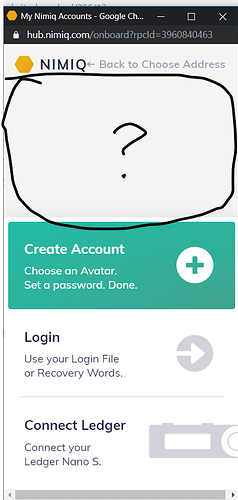
Instead of “Login” on the splash screen it will be more clearer to say “Wallet” if you’re already logged in into your wallet, “Login” should only be used to login if there are no wallets currently in the browser.
Great job on the new website it’s looking awesome!
My point of notice: the menu bar. On PC screens, when you scroll down it disappears, and you have to scroll up a bit in order to show it up again to use the navigation.
That is sexy !
Well done team !
These icons in the shape of the logo make the logo look weaker. They show no respect for the logo.
As an example, no one is allowed to write/put anything on top of the country’s flag. That would be an insult for the peope of that country.
This is also stated in all brand guide books. Never write/put anything on top of the logo.
Also, it diminishes the value of the logo, because when used as an icon, it becomes the icon. Icons are everywhere and they are cheap.
I think the logo is great. And the idea that community can interpret the logo for their own needs is also great, because that’s aligned with the mission.
I’m only suggesting to not to make the logo look weaker and unprofessional on the official home page.
And guys, invest into the re-design of the identicons. It should be something simple and unpretentious, smart and cool. That will make a huge difference.
Completely disagree with this, I think the best way to create a standard is to use it yourself. And the logo was designed specifically with having the team/community place icons or images on top of it.
Nimiq’s style guide says to use icons on top of the logo to show the association with Nimiq and so they’re doing the same thing on the homepage. I like that it adds some cohesion to the whole site, and it doesn’t feel overdone.
And regarding the identicons, are they not already simple, unpretentious, smart, and cool? What would you change specifically, and as I’ve asked before, why must it be an official change across the brand.
Current identicons are clean to look at, easy to understand and say out loud (the red duck wearing a monocle, floating ball with a hat and swirley eyes, etc…), they use material colors which is all the rage, and they’re also recognizable (I immediately would recognize a Nimiq identicon if I saw it somewhere on the web). Maybe you want them to look more professional or something, but don’t hide what you want behind implying that the current identicons are complicated, pretentious, and lame.
And as I’ve said before, if you have a different vision for what identicons should look like you can design and use them yourself. The identicon library was designed in a way where the icon graphics could be swapped out without any changes to the code (as long as the names and number of resources are the same). Most identicons come from a centralized API anyway (I use mopsus) so you could easily provide people access to your redesigned identicons by making a public endpoint. And if someone wanted to not go through your service, they’d just need to download your modified identicon code rather than using the official Nimiq one.
Overall, I agree that different identicons may be attractive to different groups of people but I feel it’s something the community can take upon themselves rather than Team Nimiq dedicating time and effort towards it.
Also, just to note:
The quality of the Nimiq code is high, maybe 9/10 or smth. Don’t know for sure or even dare to rate, just know that it’s really high.
The UX is also great now, 9/10 in my personal opinion. Super fast, and the Hub experience is 20/10.
The quality (not talking about visual quality, more about functional) of identicons is way below 5/10.
Design can create a positive, neutral or negative effect. While the logo is neutral, or maybe even positive. The identicons have a negative effect, they deminish the value of the whole.

