Its a great idea overall, I would rather have the flair before or after my name. I just wanted to give my two cents on it. But ultimately its your choice.
Out of all these look the most pleasant to the eye. But The dark blends too much with the border andis hard to distinguish. Perhaps add more inking around?
Thanks for the input! And great idea. I’ve updated my flairs. What do you think?
Just added them. What do you think?
Thematic and lovely <3
Thanks! I think these a re the ones I like best
I like those ninja’s aswel!
I think the current icons are better. Clean and neat.

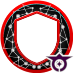
@reds , are those for flairs too? They look pretty cool!
I made these while taking a break from coding after lunch:

…feel free to use them as you please 
@rraallvv yes, they are! I just used the ones @Hextic posted above next to my avatar to see how they’d look like.
Yours are actually really cool! Lots of creativity there. The main thing is that the details won’t be really distinguishable when scaling to a small flair size. It would look cool if it was the actual avatar, but not so sure about the flair… What do you think?

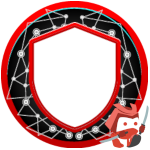
Yes, unfortunately the details are lost when the images are scaled down. I’m not sure if there is a way to use them as avatars on the forum though. Hopefully the community could come with some suggestions for a pretty cool use for those 
Depends on how you made them and what others could look like. Happy to chat about some different ways we could use them if you wanted to.
In terms of an icon, I’m still really liking the current ones now that they have the white border.
I think the samurai one would look better if the border went around the bottom and top too though.
Those are PNG images rasterized from 2d vector images, the problem is that even vector graphics look distorted when used for the those flairs placed at the bottom-right corner on the avatar image. I think I can make them in 3d and animated though 
Also made this one to be used as an avatar for bots, but then realized that it could be misinterpreted as having to do something with the social structure in medieval Japan 

They look really cool, maybe we could use them in a post introducing the ranks? That said I agree with @reds that they are a bit too detailed for a flair.
Could you elaborate on how the proposed change to the samurai logo? I think the white border is actually surrounding the bottom and top part of the sword
Ah! I see. Yeah, it seems that the swords are too big and the flair crops it. I made it smaller and applied it. On my mobile it seems to be good now. Can you check on yours?
It seems really good for a mobile flair in my book it is really awsome


