Nimiq.com New Website

Hey guys, great to see you all so involved in this! Love the passion. So let me go through the ideas and provide some opinions and thoughts, as a lot of the suggested versions were on the table at some point (we did, in fact, think a lot about this, incl. native speakers).

Better Money
This is a valid option as Nimiq strives to actually be better not only in terms of censorship-resistance, accessibility, security + we have this immutable commitment to support and fund charity projects. The problem is that it’s just so very subjective and even a bit cooky. Telling users that we’re better, without instantly providing hard proof is something that just does not fit our brand values.

Easy Payment
This is misleading, as Nimiq is and increasingly wants to be more than ‘just’ a payment system.

Digital Money, Easy Payments
Both claims can be made for a lot of services, e.g. PayPal, that are digital and able to process payments with ease – is nothing special. Even my German online banking could have this claim. Additionally, these are two messages and thus not matching our concept of simplicity.

Borderless Money
This can be said for any crypto and although my Euros have to be processed in an inefficient and expensive way, I can still send them over borders. Although this can be a strong argument for people in less stable fiscal/political systems it is nothing special and at the same time unfitting for a big chunk of the current target audience.

“Money being the most serious thing in the world”
Not sure I agree here. If you look at services that are successfully disrupting finance it’s for example stuff like this:
https://www.klarna.com/de/ or this https://n26.com or pretty much any crypto where seriousness is often not exactly at the core of things.
We don’t see a reason why money can’t be something nice and enjoyable while being reliable at the same time. The save choice here would be blue as the background color and instantly getting rid of the Identicons.

Hard Money. Easy.
This is a very complicated line. Like I wrote before, it requires in-depth knowledge and falls short to work for laymen users. You write "for non-educated users it simply means “Crypto is difficult” – this is the opposite of what we try to express.

Money made easy
I like this as it flows nicely and, well, is close to the current one. The question is, was money hard before? Is this a relatable problem/issue that people have and that they want to see solved. “Crypto made easy” might work better. “Easy Crypto” was our favorite for some time but we opted for “Easy Money” as we want to express our aspiration to compete with any form of currency and not just cryptos.

New Money
Very unspecific but a valid option in my eyes none the less. Although the “NIM - New Internet Money” would probably be the way to go then.

Created to reach everybody
Same goes for Bitcoin, Microsoft, bubble gum and tooth pics…

Easy. Money.
Something that I personally like. Julian, our designer, vetos it as he thinks it’s too affected for Nimiq’s brand. We might be able to pursue him though.

I’ll try to drop by more often and reply faster, at the same time I honestly can’t promise you guys that this discussion will end in a change of the headline after all. There was a bunch of discussion around it internally and so far we are happy with it. The logo was a bold decision and an unpopular choice in the beginning too but we feel that the community really embraced it in the end. What I can promise you is that we’ll do some user-testing on it.

2 Likes

Some responses, take them or leave them (I suspect they likely be left the pleas seem to be falling on deaf ears - kind ears, but deaf all the same).

Hard Money. Easy.
This is a very complicated line. Like I wrote before, it requires in-depth knowledge and falls short to work for laymen users. You write "for non-educated users it simply means “Crypto is difficult” – this is the opposite of what we try to express.

I recognize you feel this requires in depth knowledge but I disagree for the reasons I already stated. Also, the point of the “Easy” bit at the end is to say that Nimiq is not your typical difficult Crypto. So, in fact, is perfectly in line with what you are trying to express and quite understandable. Give your prospective users some credit!

Which brings up my other point. Who do you think will be using Nimiq? Its first users, the ones that will in essence put Nimiq on the crypto map, will understand the concept quite well. Those are the users we should be targeting this early, in my opinion.

I was going to respond to the other criticisms but I am getting the hint that your plan is to go with Easy Money (or Easy. Money.) and this is unlikely to change. I’ll just restate: this is a mistake.

Cheers!

1 Like

@Tammo: Thank you for your answers. I guess you know such conversations:

“Hey!!” “Hello friend!” “Do you know Nimiq?!” “No, what is this???” “It’s easy money!” “Easy money?!” “Yes, easy money… It is a simple, secure and censorship-resistant cryptocurrency!” “Simple!? Censorship-resistant? No, I don’t use crypto. I prefer real money!”

“Well, it is real money! It is very easy to use. Worldwide. Look, it is browser based! Anybody in the world can open a browser, so everybody can open a Nimiq account in just a few seconds. Merchants have additionally a very simple to use fiat-gateway. Do you get it!? Nimiq connects not only the global business world in an easy way, it is an instant peer-to-peer exchange of money! Like cash - in the internet. Securely, open-source and censorship-resistant.”

Your statement “Same goes for Bitcoin, Microsoft, bubble gum and tooth pics…” made me think about Nimiq’s main selling point again. Do your current headline convey Nimiq’s main selling point and full potential? Do you think that people could really differentiate between Nimiq and other crypto projects (Dash - Digital Cash. Simple, secure and censorship-restiant cryptocurrency. Verge - Privacy is our standard. Simple, secure and censorship-restiant cryptocurrency. Bitcoin Cash - Peer-to-Peer Electronic Cash. Simple, secure and censorship-restiant cryptocurrency. Nimiq - Easy Money. Simple, secure and censorship-restiant cryptocurrency.)

I think, Nimiq’s headline should focus on content, not design. Start with:

Nimiq is easy-to-use money, because it is browser-based, offers instant payments and fee-less swaps to home currencies. It is better money, because it is censorship-resistant, open-source, technically secure and available for everybody. And as it is available to everyone via the internet, Nimiq is the best solution for our new digital global business world and peer-to-peer currency exchange.

So, Nimiq’s selling point was/is its internet-based nature, but its potential goes wide beyond being just only the money of the internet, as even though FB is a social network provider, but social networks are about friends, get to know someone, be informed about events. It is used for personal human socializing. The users feel complete by it. The Internet is about exchanging information, learning, socializing, connectivity, storing knowledge and data etc. And now basis of storing and exchanging value.

Nimiq’s headline should catch the big idea - and transport the message that users will find the missing mosaic to feel complete again.

1 Like

It will not fit your design of simplicity, but this is Nimiq’s content from my point of view:

Key to Open Money

Simple-to-use, secure and censorship-resistant cryptocurrency.

Availability in seconds via standard internet browser.

Free and easy terminal integration. Instant payments.

Enabling feeless swaps to your currency of choice.

2 Likes

I like the summary, especially the first two points! I think it’d be better as bullet points rather than as a Header with Sub-headers as you have it now, and you could add some more points since you seem to have a good grasp on what Nimiq’s about :slight_smile: !

The last two are a bit confusing, and “Enabling feeless swaps” seems like an over promise since many services take a fee on coin swaps and Nimiq can’t guarantee they wont.

You really should consider “NIM - New Internet Money” as being the slogan of the brand. Even changing the name Nimiq to simply NIM. That is very simple to explain and is on bar with Bitcoin when branding is considered. Just my two cents.

4 Likes

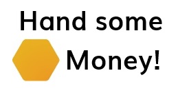
Does this line feel nimiq!?
hand

It feels like a Reddit pun tbh :sweat_smile:

Well, it absolutely depends on how this pun works for native speakers. I finally get the idea of ‘easy money’. It is to grasp attention and create curiosity - polarization here is not bad at all. But people need to understand on the second thought, that it is about a secure and valued currency which is just easy to use for retailers and customers. That is why the sub-headers are high important. As an example:

Simple-to-use, secure and censorship-resistant cryptocurrency.
Availability in seconds via standard internet browser.
Free and easy terminal integration. Instant payments.
Enabling feeless swaps to your currency of choice.

Such sub-headers prime with a vertical SAFE and address customers as well as retailers. And they are informative.

If ‘Hand some money’ is a valid pun than it could include more positive curiosity compared to ‘easy money’.

I think polarization is a good thing, but too much of a good thing can be bad. We already have such a thought provoking and meaningful logo, why try so hard to be mysterious with the slogan. Nimiq is supposed to be straightforward and easy to understand, so why shouldn’t it’s slogan?

Plus the word “easy” within 2 words of “money” just has a really bad connotation.

1 Like

In addition: NIM - Native Internet Money

1 Like

Sounds stupid to me. It is new today, it will be old tomorrow. A „timeless“ slogan would fit better imho

After reading all of the explanations and suggestions, Open Money is good. It’s short and sweet and you DO NOT need an entire forum thread to explain it. It should grab you immediately and place an idea in a users head and this accomplishes that.

Great job on the new site, looking good!

I think Easy Money is a great idea. Similar to the plain hexagon logo, it took a while to grow on me. But now I think it’s a fantastic slogan, just as I now think the plain hexagon was a stroke of brilliance. There was some other part of the site that said Easy Access. Making ‘Easy’ a theme that shows up in different parts of the website would drive home the point of Nimiq’s ease of use. I see they changed it to Open Money; personally I’m not clear on what that means.

Hey guys, so we brought the discussion from here back to the entire team and ‘Open Money’ is the result. It’s close to its predecessor in terms of being crisp and easy to grasp. It’s a trade from being a bit provocative and thus activating to being a more positive and inviting while remaining a bit cryptic and thus creating curiosity. Personally, I think the ‘Easy Money’ would’ve worked better but I’m happy with ‘Open Money’ as well.
Why ‘Open Money’? Accessibility is key to Nimiq and in the end the motivation to be easy. This is reflected in the UX, in being open source but also in the way the community is welcoming and, well, open. Nimiq is a payment system that is open to everyone, no matter where you’re from what you believe in or how wealthy you are. It goes hard on the borderless character – although this is a given for a lot of cryptos.
It’s also representative for the way the team works, with close to nothing being kept secret and everyone is able to express themselves and be heard.

Thanks to everyone who engaged in this discussion so far, we wouldn’t have iterated the slogan without your input.

5 Likes

Thanks, we sure did put a lot of work in it, haha although I guess the result looked more like we just killed the Dollar sign.

I think Nimiq s goal should be to somehow become a better VISA Payment method. The Nimiq tech makes it easy to use. Nice. This could be pointed out with something like: „permissionless and decentralized payment system built for everyone“

“Open Money” is so catchy, that there already are some sites named after it. openmoney.org, openmoney.info, openmoneyinitiative.org, open money twitter account. I assume you would not use it as a brand though.

Glad that is settled! Couldn’t be happier - well, I could, but beggars and choosers, you know? Now, about that switch to POS… :wink:

1 Like

I’d personally prefer more serious words. Nimiq is funny with those Icons, wich is good… but we shouldn’t forget what Nimiq is: money. We need some contrast to the beautiful and awesome looking UI, with a simple and yet serious slogan for Nimiq

1 Like