Staking Interface Feedback Thread

Hello everyone,

we spent the last months trying to get the best staking experience for Nimiq 2.0 and the Nimiq Wallet. We put together a prototype to test if we hit the mark, and would love to get your feedback on it.

This is the prototype, please comment your feedback in this thread. Thank you!

Pura Vida!

7 Likes

Pretty sleek I must say, the process seems quite clear with enough additional info via tooltips. A suggestion would be to make the initial staking icon (which is quite small) more prominent image

2 Likes

Looks good. I would love buttons added in the area close to the slider to pick 25/50/75/100% but I don’t know whether there is enough room. For the rest, it works quite intuitively.

I have not really looked at the graphs represented in the UI. Do these adjust to the percentage offered and the amount staked? If yes, is a graph sufficient or is a simple text explanation showing the expected rewards in a basic manner better?

image
This is not good use of the revenues! :joy:

Otherwise I agree with Wekkel and Frans points, I must say I’m not a big fan of the sliders overall too (this goes for BTC/NIM swap too).

My only fear is that there are too many big numbers on the screen at some point which would be confusin/overwhelming for new users who never used a crypto between:

  • total balance
  • accounts balances
  • balance staked
  • staking reward
  • balance available
  • transaction history
  • price of NIM and BTC
4 Likes

Great job you’ve done here. Well done :ok_hand:. However, I first clicked the link on my mobile, but it took time to load and couldn’t even use it because buffering wasn’t completed on time. I had to load it on the PC. The loading was pretty fast and smooth on PC. Staking procedure was straight forward. I only noticed that the interface took more that 100% of my screen or was it intentional? :smiley:

In all, its a good job well done. I look forward to its eventual availability.

Very smooth process, seems well thought out. @Frans suggested making the icon more prominent, I think It’s sizing is pretty good. I think if it had a soothing highlighting animation (icon getting brighter then back to normal) until the user clicks the icon might be good.
Perhaps a link in the tooltip explaining staking more in depth would be good too.

Stoked about the development, hope you guys are in the final stretches :smiley:

  1. I feel like there is a better choice of words than “so called validators” when beginning the staking process inside the wallet. Maybe something like “Staking pools, better known as validators, facilitate this process”.
  2. This might be more of a prototype bug than anything, but when you are on Step 2 and you go to see the Rewards History, you will get stuck on the Rewards History screen unless you go quick. After you click on the ‘x’ to go back to the staking screen, after about 1-2 seconds it will automatically go back to Reward History and from there I cannot leave the screen at all. Have tried this twice on Firefox, Ubuntu. Curious to know if others have the same issue or if it’s just me?
  3. Would like the section that represents the possible staking rewards to be shaded a little more in green so it’s more apparent/obvious which area is the possible staking rewards. This would be mostly benefit in Step 2 when you’re adjusting your stake.

I think it looks quite great overall, great job! Looking forward to seeing the testnet product in action.

1 Like

Very intuitive to use.

I do think the page is cluttered. I’d like to be able to hide (or collapse) the addresses in the middle column. Same with the transactions in the rightmost column. Just to have a less detailed version that is easy on the eyes.

Great job Team!

1 Like

Hi Team,

I am very new to the community, but here are my recommendations for the staking interface:

  • Staking should be included on the left-hand bar above “Blue account” and network" (easy to read and access as well)

  • Staking and un-staking slider bar needs an option to type in NIM amount. Users that are on trackpad might find it hard to stake a specific amount

  • Staking needs a tickbox for “auto restaking.”

5 Likes

Personally I love it but I fear that the interface is still too complex (or too busy) for a non-initiated person, have you ever considered offering an advanced version and a simple version of the wallet and thus of the staking process? I often see this option in the web interfaces I use. It could avoid sometimes unnecessary compromises between a full information display and a clear and simple interface.

3 Likes

Great again but agree with some others that the wallet looks very busy. A lot of numbers and it takes time to figure out what everything means and is. Would love to see a more simple wallet with all options in a menu or a few buttons on the side

1 Like

Great to see the progress on the path to Nimiq 2.0!

My gut reactions and initial impressions feedback:

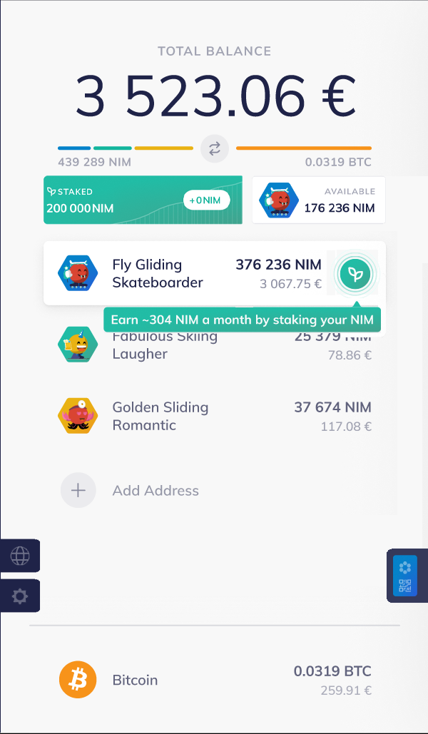
  • I initially expected to see the Staking option button on the left, somewhere near “Buy” or “Sell”

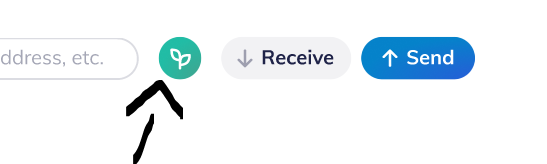
  • I initially thought the leaf button was too small to notice for newbies to intice them to stake.

Having said that, after running through the prototype a number of times I am starting to get a sense of the design intent for placement and size of the elements - you might be teaching me what things ought to be and adjusting my preconceptions here. Some other thoughts:

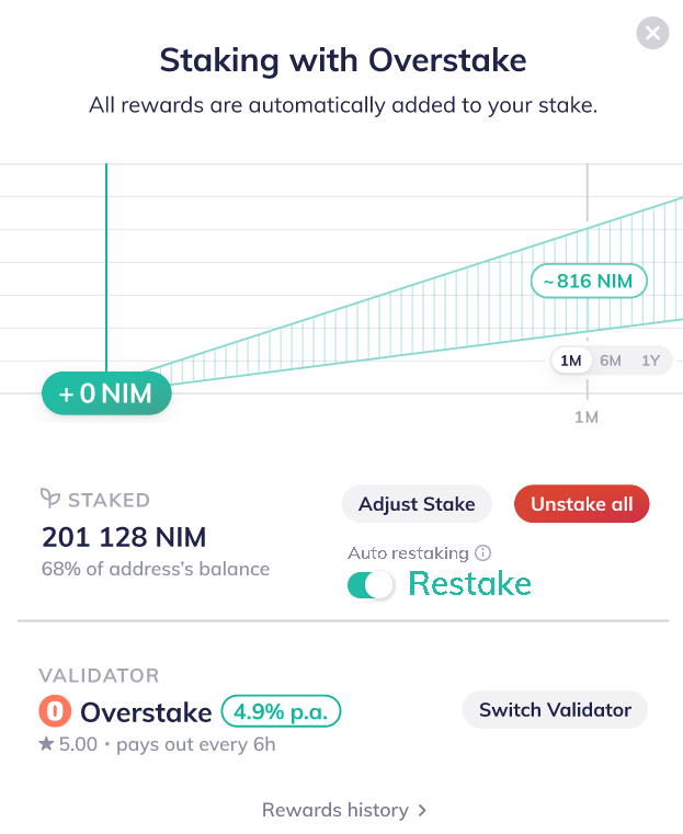
  • where did the “Search” bar and “Receive”, “Send” buttons go just before you have to “unstake all”. The “staked” amount is visible in a large green rectangle on top, which is great and very visible.

  • when adjusting the amount to stake I understand it would be easier to just have input fields. But there it’s somewhat intuitive that clicking the NIM amount on the right staking the “Max” amount in your account without the need for a “max” note.

  • I think graphs can visually appeal to the entry level users who are onboarding into crypto for the first time with Nimiq. It’s a lower denominator move in my opinion but can be very effective. Let’s put it this way - I don’t think it will turn away die hard crypto users.

Thanks for the Prototype. Can’t wait for Testnet!
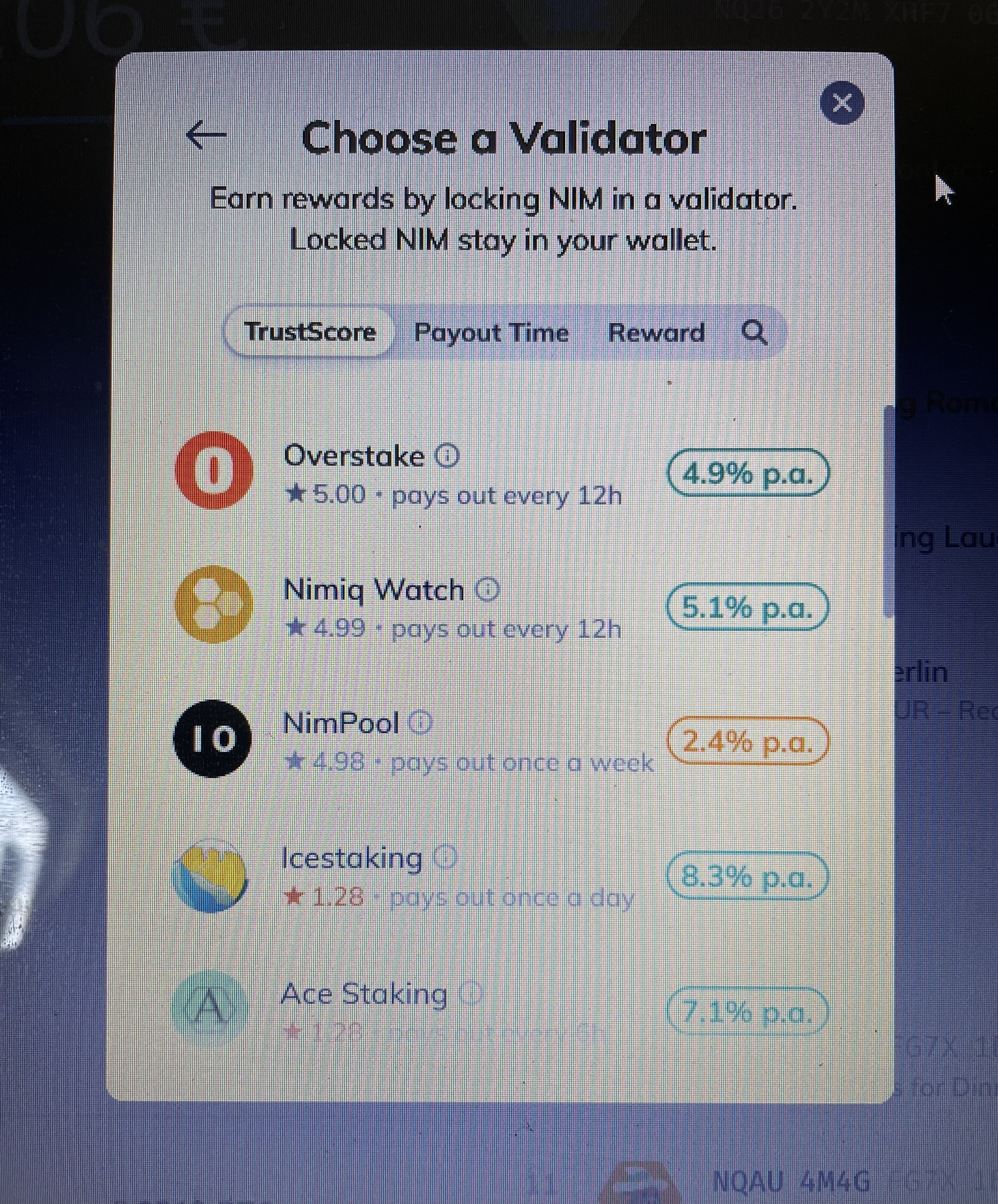
2 Likes

Just had my wife (a person who has never dealt with crypto) try the demo and she was put off by the initial wallet. She was very confused by all that was going on and wanted to stop without even clicking anything.

She couldn’t find he staking button quick enough. She wanted to quit before i pointed out the button. After she clicked that she took it from there.

I really think that a more simple version with just a total balance and and a big green staking button as an introduction would be much better. All transactions and additional wallets should be attained by going to a more detailed version of the wallet.

8 Likes

Made a concept that might suit your needs…

Hi Team,

Great prototype and there have been brought up valid points already!
Maybe this is not part of prototype but I feel it’s necessary to have the option to stake at a custom validator where you can enter you own validator information.

Greetings

Looks great and it is quite intuitive to use. Perhaps it is possible to make the percentage rewards less prominent when choosing a validator? Many people will pick the one with the highest reward and not worry about decentralization.

2 Likes

I just assumed this was left out but I 100% agree with this. Especially if by design you only should be submitting your 10k NIM to set up your validator and then delegating the rest to your validator.

Regarding Trust Score and percentage rewards. In my initial interaction with the prototype I mistook the % rewards for the trust score. Both have decimal points; I wasn’t expecting to see both at the same time, to have to pick based on both. Also, if votes are tallied, my vote is to make the Trust Score more prominent.

Two weeks ago I shared my thoughts regarding the name “Trust Score”. I’ll repost it here for easy reference:

I have some concerns with the name “Trust score” as it implies that validators with a low score are bad actors and can’t be trusted. For uptime and amount of correctly created blocks I understand the name. But for a pool becoming big, it’s not a bad actor, it’s becoming popular. If a relatively big pool would advertise to bring new people in, and people then see that this pool has a low trust score, I would be discouraged. And at some point maybe even confused because in a matter of days, the trust score could increase because the total amount changes constantly.

2 Likes

May I suggest:

  • “Decentralization Score”

  • or just “Validator Score” (for decentralization)

Something along the lines that makes it known to the user that picking the higher score helps with decentralization and securing of the blockchain, with benefit of knowing the validator has been around awhile.

1 Like